...a scratched Lil Flip CD resting on the back seat, eight black ice air fresheners bundled to the rear view, clothes and books for long car trips.
MONOLITHIC
The great gulf between these hopes and their realization seems to illustrate the Underground Man's point: it can be a creative adventure for modern men to build a palace, and yet a nightmare to have to live in it.
— Marshall Berman, All That is Solid Melts into Air
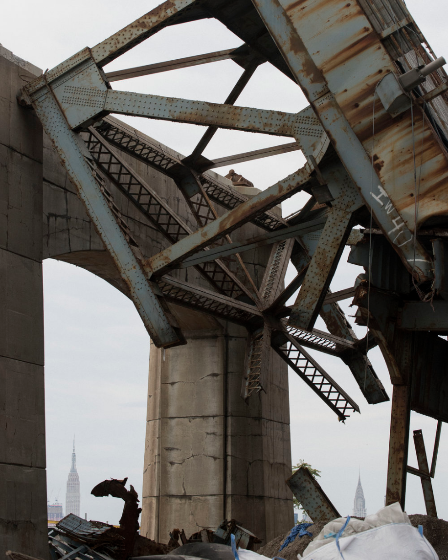

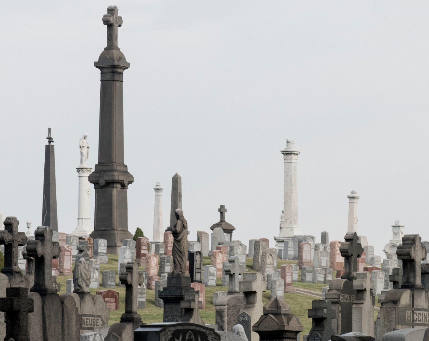
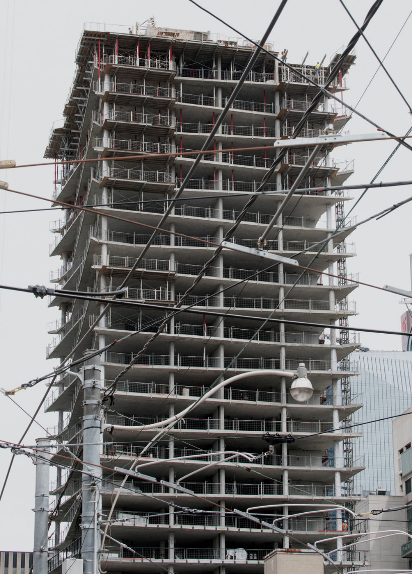
Richard Anderson (from top), Toronto ; Maspeth; Chimaltenango; Kosciuszko Bridge, (all) 2017
Romke Hoogwaerts You shoot a lot of cities, looking at monolithic structures, their attitude, rigidity, dysfunction... in all, it seems like it's really about contemplating the consciousness of modernity, at least in the realm of architecture and sociology.
Richard Paul Anderson When I was living in Milwaukee in 2008 I was almost immediately drawn to the outmoded factory infrastructure throughout the city. Engulfing, hollowed out spaces really helped define my visual interests early on. When I moved to Chicago in 2010, my first interaction with one of the more sociologically conflicting manifestations of modern architecture came from the cities own public housing efforts and its infamous physical footprint such as the Cabrini-Green Homes, and the Robert Taylor Homes. The vacuous, empty space that would replace over three thousand units had me thinking differently about the evolution of cities especially in the modern age.
Chicago has a distinctly cold and stern face that undoubtedly defines the way I approach certain environments. The city stands over you and everything has structured weight. It feels, and it looks, strong and well-weathered. For a time around 2015 I wanted what I was photographing to function similarly, and I had just seen a Richard Serra drawing at an art fair that had me thinking about how to add weight to an image. It’s important to me that what I make doesn’t fall into any of the ruin-porn tropes; I want to consider photography in all of this seriously, part of that is being conscious of the camera’s role in serving sociological issues appropriately. I want to be critical of my surroundings and for the time being, that’s a burned down home, or a van in a junkyard. Both serve certain narrative purposes equally but are admittedly servicing a more nihilistic approach. I’m getting out of the shadows a little more every time I go out.
In Robert Sommer’s Tight Spaces, the author states “The dream of a society in which people who share a common goal, will trust and respect one another, is being suffocated in a torrent of concrete, steel, and sophisticated security equipment.” Sommers’ passage compliments Marshall Berman’s comments on modernity, in that it considers the failure of its creator, as ourselves, an increasingly paranoid and supposedly “enlightened” society.
Romke How does your work about architecture relate to your work about car culture? Those photographs seem to embody a kind of clinical investigation of the machismo behind it all.
Richard I’ve been astounded by the shape and sound of cars my whole life. There’s a certain excitement that comes with photographing motorsport in virtually any form, car shows, everyday vehicles on everyday roads, the marketing methods, the language, graphic quality, etc. Car culture, to me is invariably something to be celebrated.
The shelf life of a mass-produced product like the automobile is something I feel invested in as a subject. Stylistically, it conures up some of the same feelings some of the earliest pictures I was making of factories, a good portion of the work in Blown Transmission was mostly made in scrap yards or pick-a-part lots. I was also photographing auto shows, scanning sales catalogues, and putting those images up to scale with their inevitable obsolescence.
Sitting in the back of a junked out conversion van I’d witness artifacts suspended in time, like a scratched Lil Flip CD resting on the back seat, eight black ice air fresheners bundled to the rear view, clothes and books for long car trips. But with the driver and passenger airbags deployed, the windshield caved in, two decades of Marlboro 27's soaked into the interior, it becomes something else: a tomb. I’m interested in that transformation from a road bound, functioning family van to a violently impacted and haunting space.
To your point, I do enjoy picking apart and poking fun at some of the more overtly exaggerated aspects of it all. Undoubtedly, there is a dominant machismo posturing that defines the history of the automobile for better or for worse, especially in the U.S. Hopefully I’m chipping away a few layers or allowing people to think critically about cultural attitudes in that way as well.
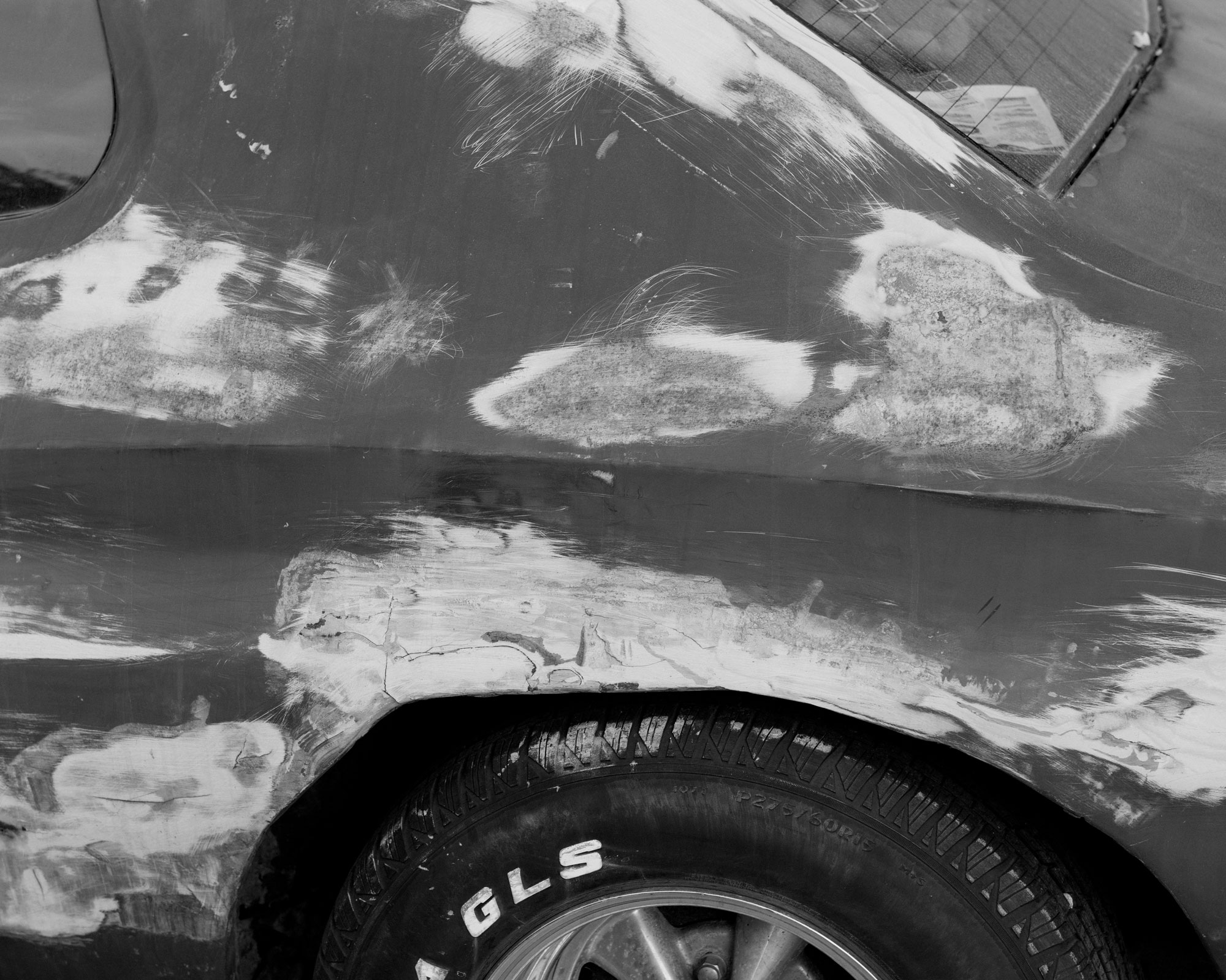
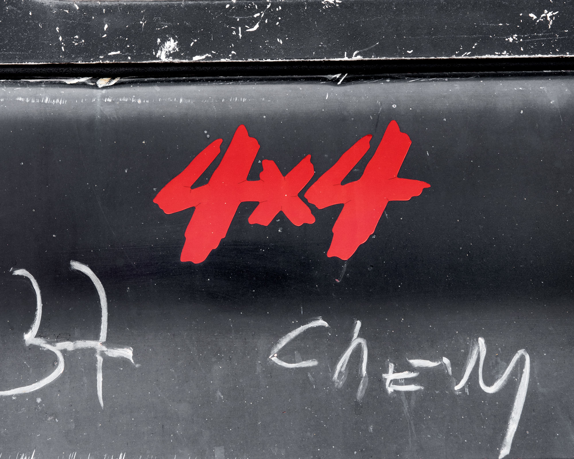
Richard Anderson (from top), Chicago U-Pick-A-Part, Angel’s Tire Shop, 2016
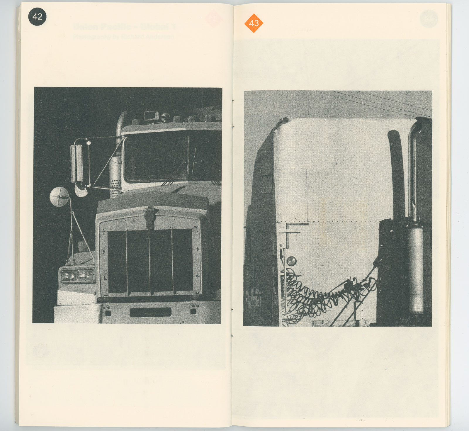
Romke The format of Life Blood is brilliant, very narrow and claustrophobic, a little pamphlet-like, very slick design. How did that come together?
Richard Life Blood came out of an idea my mate Kevin McCaughey and I had to put together a book about the U.S. trucking industry. Our old studio space was next to a large freight yard so it felt natural to set up a chair and photograph trucks going by the studio every day. I had also been collecting a few old magazines dubbed “the voice of the American trucker” called Overdrive that we used a bunch of clippings from.
Richard Life Blood came out of an idea my mate Kevin McCaughey and I had to put together a book about the U.S. trucking industry. Our old studio space was next to a large freight yard so it felt natural to set up a chair and photograph trucks going by the studio every day. I had also been collecting a few old magazines dubbed “the voice of the American trucker” called Overdrive that we used a bunch of clippings from.
![]()
![]()
![]()
Richard Anderson, Spreads from: Life Blood, 2017, published by Non Porous


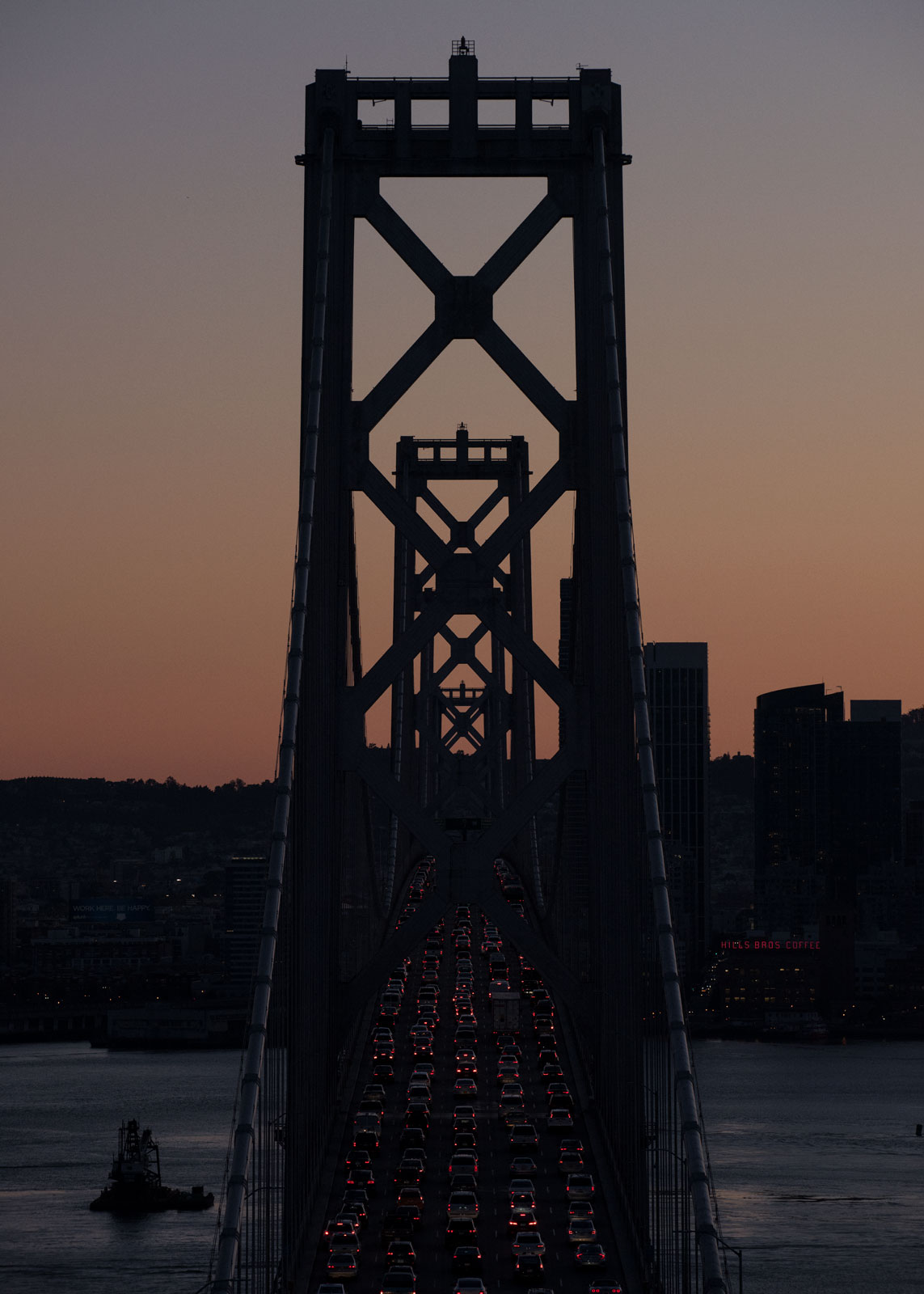
Romke So in this photo, Treasure Island, we're looking through the Bay Bridge, right?
Richard We’re looking at SF through the Bay Bridge from a high point on Yerba Buena, adjacent to Treasure Island. I stayed on Treasure Island for a few days and found it visually astonishing. There were crews wrecking out huge blocks of old naval barracks and office buildings, tossing them into (supposedly harmless) radioactive waste piles in resident’s backyards. My good friend Antonyo lived on the island and took me up to this vantage point my first night in. It felt like a picture that stylistically, I didn’t want to make- but the vibrancy of light in the bay was something I’d never witnessed, and one seldom has the opportunity to marvel at a large-scale bridge in the Midwest.
Richard We’re looking at SF through the Bay Bridge from a high point on Yerba Buena, adjacent to Treasure Island. I stayed on Treasure Island for a few days and found it visually astonishing. There were crews wrecking out huge blocks of old naval barracks and office buildings, tossing them into (supposedly harmless) radioactive waste piles in resident’s backyards. My good friend Antonyo lived on the island and took me up to this vantage point my first night in. It felt like a picture that stylistically, I didn’t want to make- but the vibrancy of light in the bay was something I’d never witnessed, and one seldom has the opportunity to marvel at a large-scale bridge in the Midwest.
Romke How did you meet Andrés and how did your exhibit in Guatemala come about?
Richard I met Andrés back in January 2016 in LA. I’d been keeping up with his work for a while and really admired his approach to photography. I had picked up his book Ideas De Progreso, and shortly after I’d gotten home we were in talks about working on a long-term project together. The concept came together pretty organically, a little over a year ago. We settled on shooting our respective centers: the center of the U.S. and the center of the Americas. Three days after we’d discussed a concept, I drove ten hours out to a small town in Kansas called Lebanon to make the work. Shortly after, Andrés drove out to Cuilapa, about an hour and a half north of Guatemala City. We ended up finding a home for the work at La Erre in Guatemala City. The space was a lot larger than we’d originally anticipated, which really challenged the both of us and I think made for an interesting show. It’s an ongoing project, so there are a few things we have planned for the upcoming year.
Romke Can you tell me what the thesis of the show was?
Richard We really just wanted to allow our work to come together in a unique way so we both had to gamble on a seemingly unknown destination for a lot of visual information. Two Americas photographed by two “Americans” working at a distance. In the case of Lebanon, geographically it doesn’t account for Alaska or Hawaii, so the center is a precarious and relatively intangible thing. Pure curiosity got me there, as the town only boasts its presence as the center of the U.S. in bumper sticker souvenirs or in the header of its local newspaper. We were also playing with the word “America” and working to converge our own ideas into a coherent point of reference for each place, utilizing the visually mundane and unique equally. Additionally, the subject of rural America right before a polarizing election was something I wanted to pursue for myself. We were really lucky to have Paula Kupfer writing for us. I think she really understood how we individually approached the project and brought our concepts together.
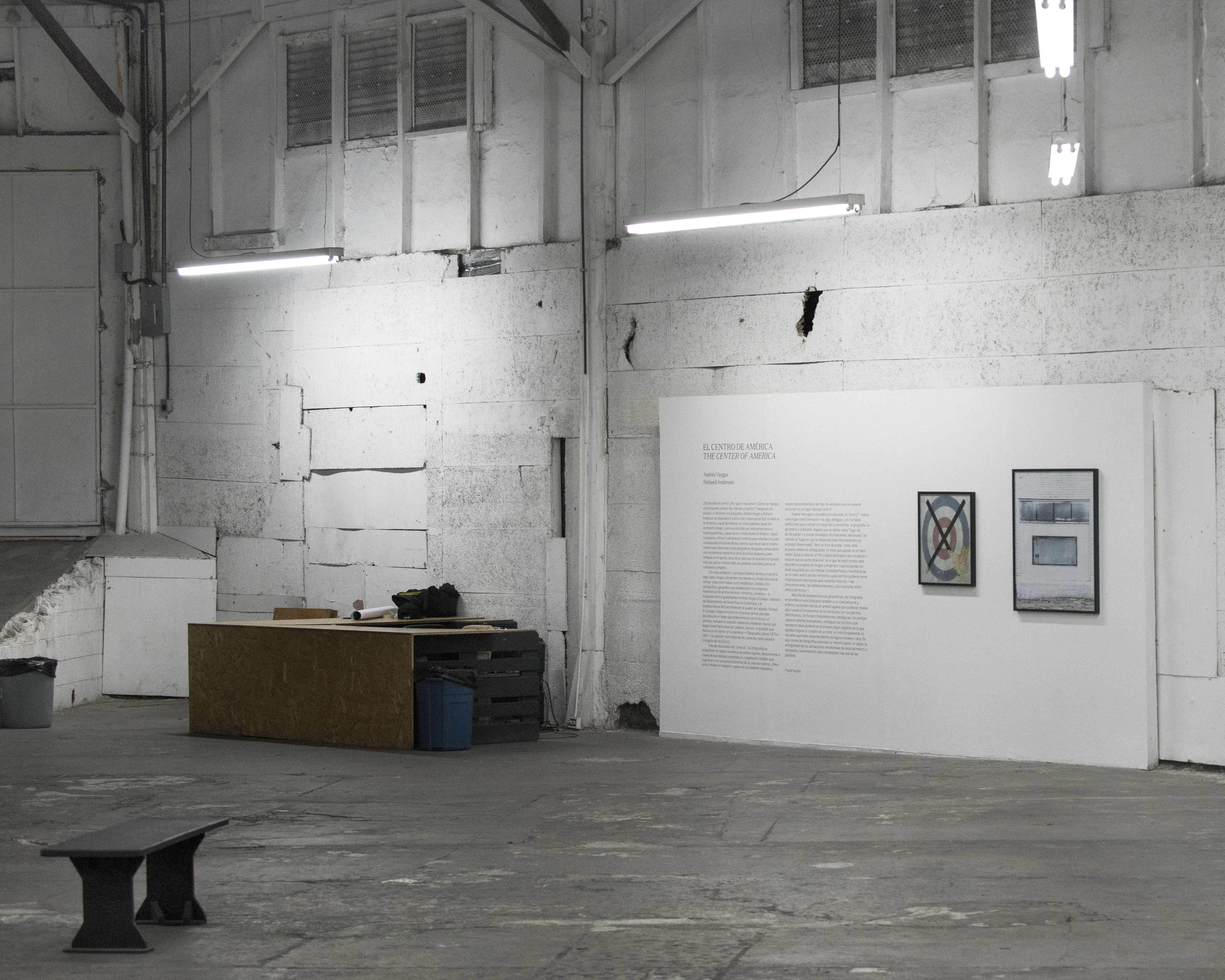
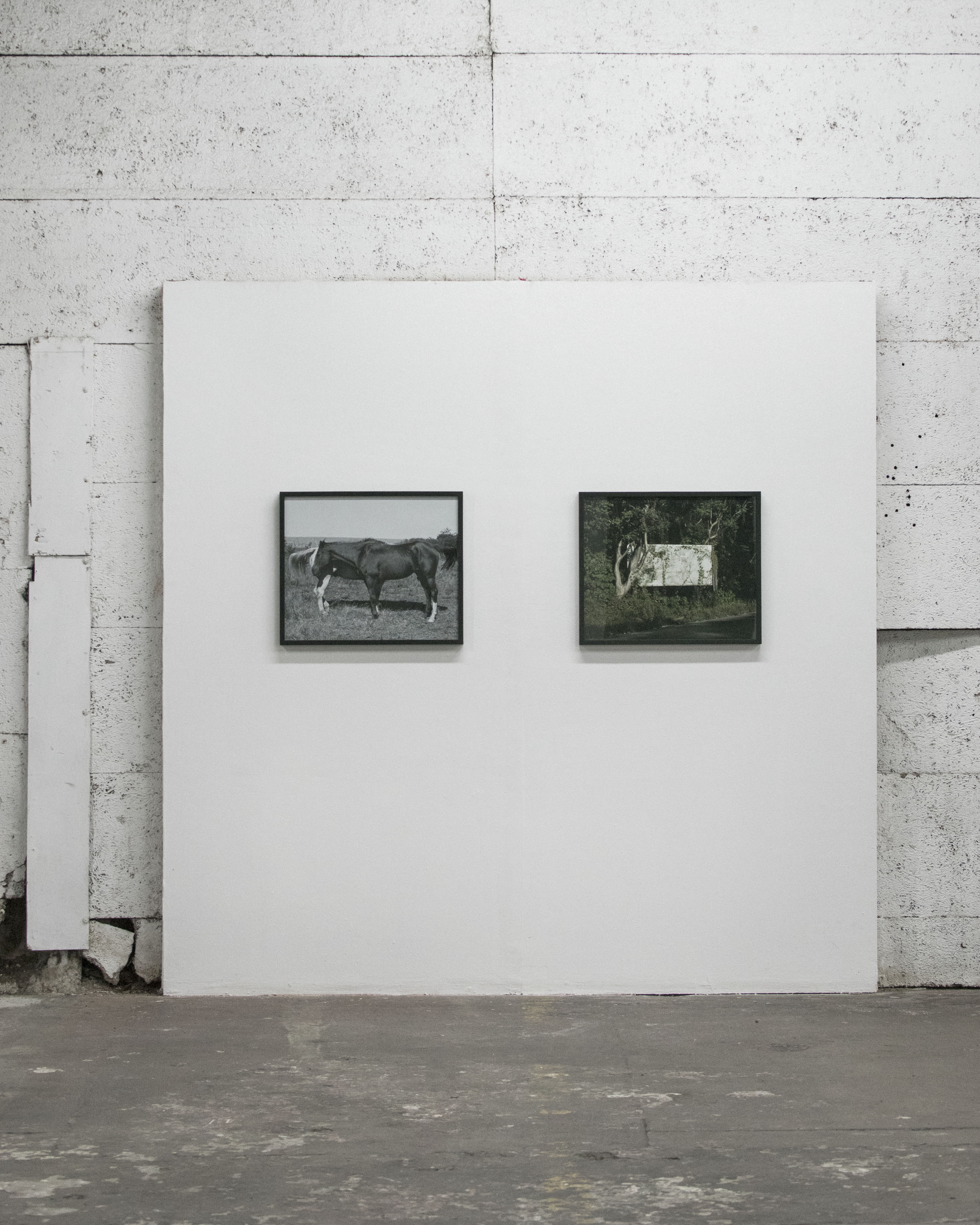
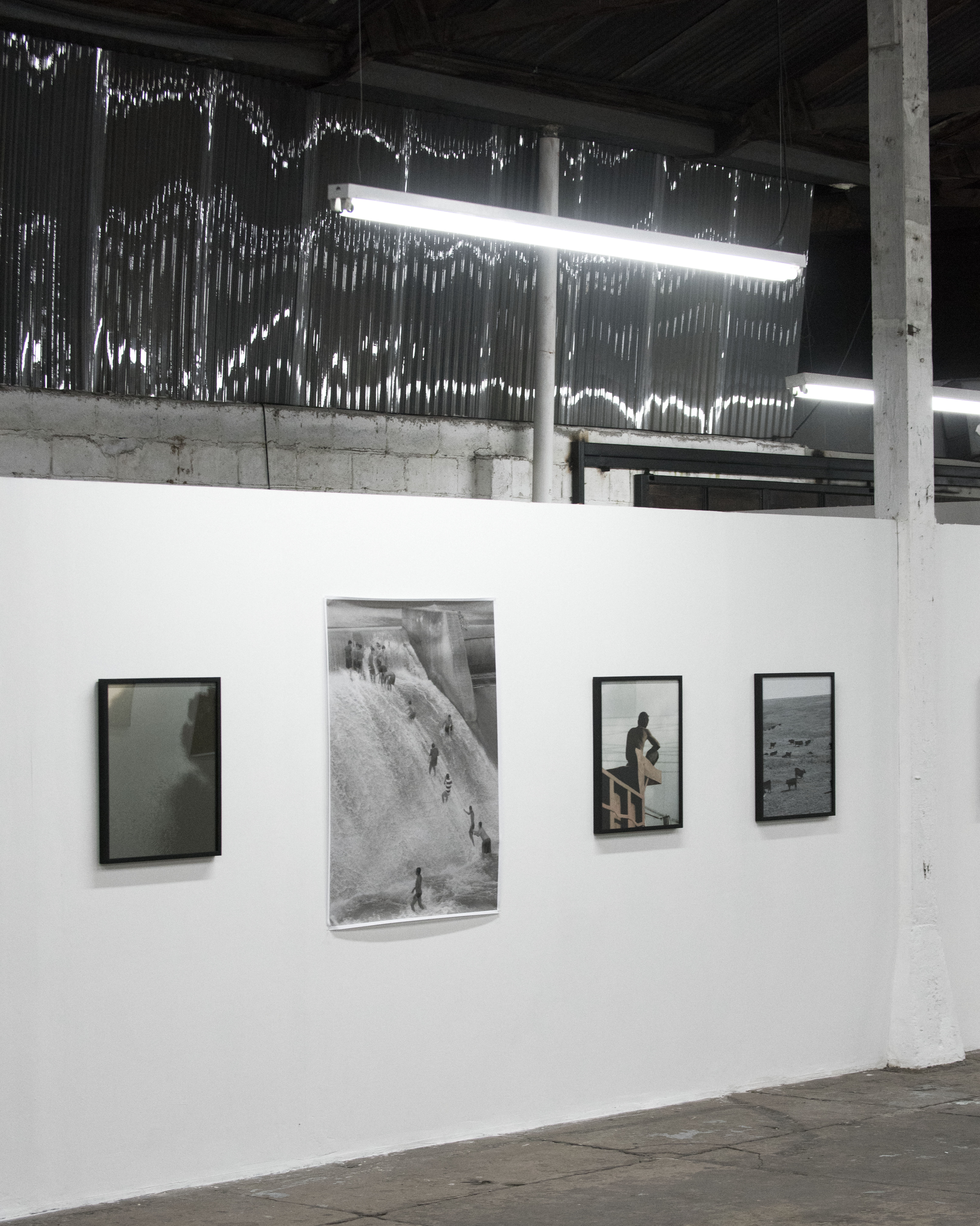
Richard Anderson and Andrés Vargas, La Erre, Guatemala City, 2017 (install photos)
Paula Kupfer
Where is the center? Why do we seek it? How do you handle a search when there is more than one center? Working as a team and at a distance, photographers Andrés Vargas and Richard Anderson set out to find and represent two nuclei: that of America and that of America, in other words, that of the whole continent as it is known by Latin Americans and Spanish speakers, and that of the United States of America, whose citizens use the abbreviation America to refer to their country. The simultaneous search of two centers that bear almost the same name but describe unequal geographical areas indicates both a semantic incoherence and the carefree attitude reflected in the voracious appetite of a country that has sought to conquer more than just the name given by colonial powers prior to the continent full.
With this exhibition, the first instance of this long-term project, Vargas and Anderson reveal their joint view in portraying both real and metaphorical sites. Thanks to the cartographers and geographers who established the mathematical hearts of both lands - America and America - the search took Guatemalan Andrés Vargas to Cuilapa, capital of the Santa Rosa state of Guatemala, and American Richard Anderson to the town of Lebanon, Kansas. In Cuilapa, Vargas found in the central park an old sculpture of a map that previously, with a bow and a pendulum, marked its median position. Anderson drove for long hours to reach Lebanon, Kansas, a town marked with a road sign - "Geographic Center of the USA" - its position as the focus of the forty-eight contiguous US states.
Once the "centers" were reached, the photographers endeavored to capture the essence of both places, discovering through their landscapes, architecture and vegetation details that suggested or not a self-awareness of their central position. But how to portray a space and capture in its worldly details transcendental keys of the kind of truths that are expected to find in a place called center?
Despite suggesting an absolute definition, the "center"—as a place as a concept—is somewhat ambiguous, with multiple definitions that place it throughout semantics, geography, geometry, and philosophy. What is defined as "the place where information, decisions and decisions converge" is also the "place where a given activity is most intensively developed". But a focus of power, as this project points unambiguously, does not have to remain in the middle. Perhaps the idea of a "main end or object to which one aspires or is attracted to" is the one best suited to describe the project of Vargas and Anderson, whose search was undoubtedly guided by an intense physical and metaphysical curiosity to see the mere center of two territories whose centers might have important implications for our histories - Latin American, American, and relations between both territories.
Beyond potential geopolitical readings, the photographers undertook this search also on a personal and aesthetic level, looking for marks in both places that could reveal some fundamental aspect of the territories with which we identify ourselves. Without forcing ideological interpretations, the artists captured evocative and ambiguous details of the sites they portrayed, discovering in the process some aspect of what it means to get to the heart of a myth: a fundamental myth without narrative that we all carry in some way or another. It is here where the photographs reach their maximum power, by capturing the ambiguity of the simultaneous sensations of discovery and deception, conveying this complexity beyond words.
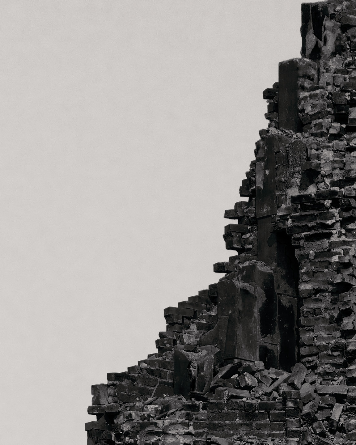
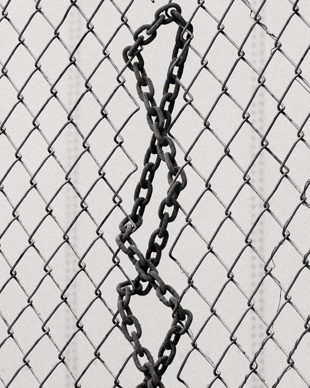
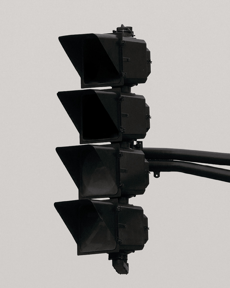
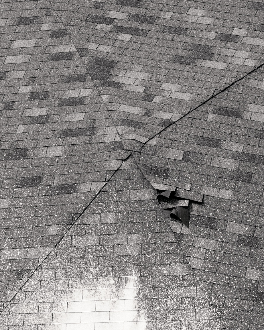
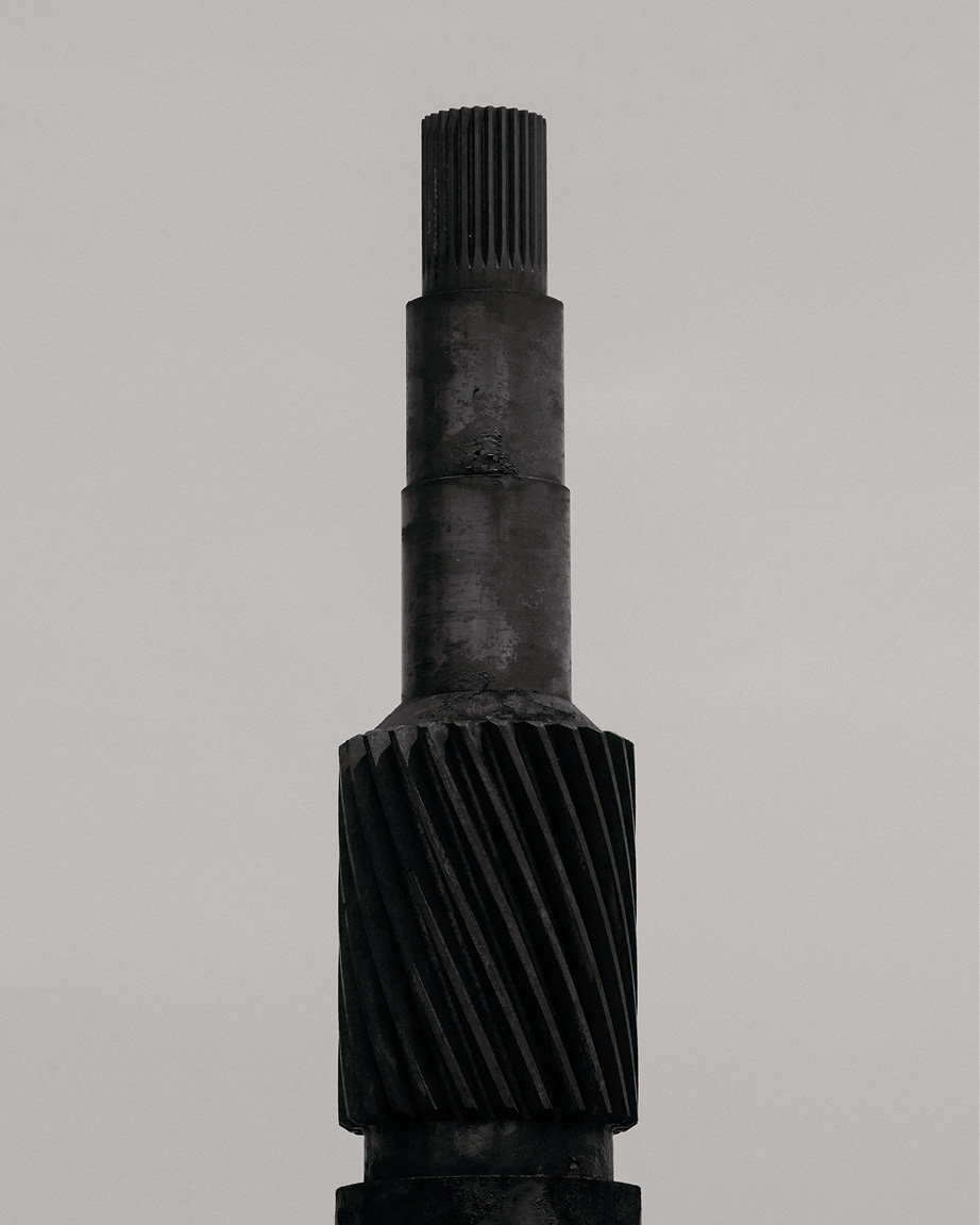
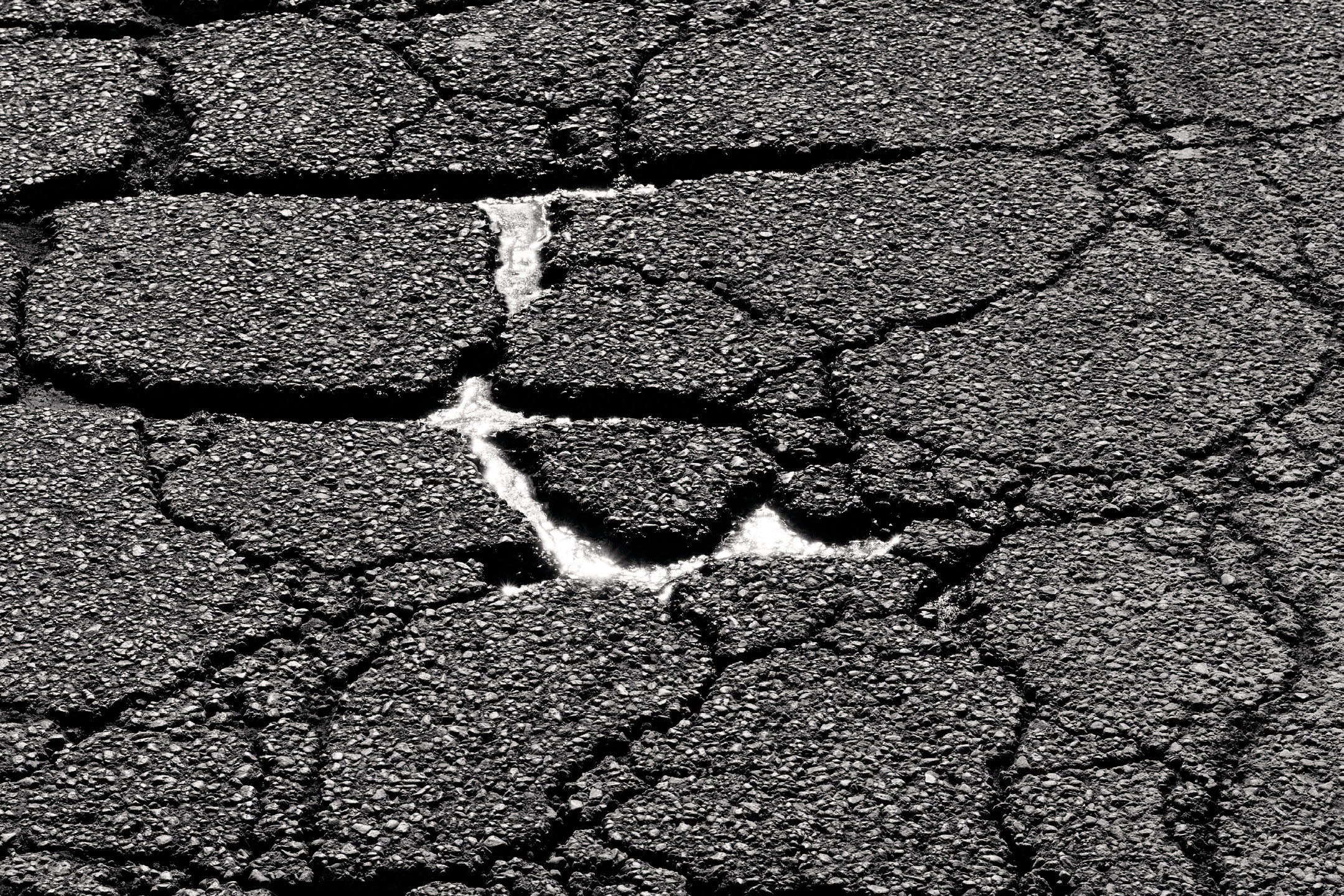

Richard Anderson (from top), Rush University, Jones Building; Back of the Yards; Chicago; Salt Hut; Finkl Steel; General Iron Industries Inc, (all) 2016, from the series City of the Century
Romke Where else have you lately exhibited? Do you have anything else in the works?
Richard I had a show at a new space in Milwaukee (Gallery Kenilworth) for some of my newest work—SEE RED in August last year; Andres and I are continuing our work on El Centro De America; and Kevin and I are working on another issue of Life Blood.
Richard I had a show at a new space in Milwaukee (Gallery Kenilworth) for some of my newest work—SEE RED in August last year; Andres and I are continuing our work on El Centro De America; and Kevin and I are working on another issue of Life Blood.
︎
Richard Paul Anderson (b. 1992) is an artist living and working in Chicago. He received his BA from Columbia College Chicago in 2015 and has released 2 publications since: City of the Century: 2016, and Blown Transmission: 2018. Last summer, Anderson debuted a new body of work in Guatemala City, produced in collaboration with Andrés Vargas: El Centro De América—The Center of America.
Romke Hoogwaerts (b. 1990) was born in Atlanta to Dutch parents, raised mostly in South East Asia. He is the editor of Mossless, co-publisher of Rubber Factory Posters and co-editor of The Reservoir, and has worked in the photo departments of Bloomberg Businessweek, NYT Magazine and MSNBC. He currently lives in Brooklyn where he is developing his first monograph, Vreugdevuur Scheveningen.
